Garden Design
Plants and flowers come in a large variety of colors and hues. When planning a garden landscape, take color coordination into consideration.
The background is an important consideration when planning a garden color scheme. If you are planting next to the house, the color of the house is important. Select plants that will complement the color of the house that provides the backdrop for the garden.
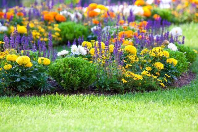
Masses of a single color produce a stronger impact then gardens with a mixture of colors. Bright schemes will stand out and be more noticable than dark schemes. Red flowers are noticeable drawing attention from a distance. Darker hues, such as blue and purple, can only be enjoyed from close up.
Colors that look good together are harmonious with each other. Color schemes that use the color wheel, including complementary, monochromatic, analogous, triadic and polychromatic.
Complementary: Opposites on the color wheel. Complementary color combinations include red/green, yellow/violet and orange/blue. Complementary color combinations offer contrast in the garden.
Analogous: Use any three colours that are next to each other on the color wheel. Examples are :yellow/yellow-orange/orange, violet/blue-violet/blue. The analogous color scheme always looks coordinated and right. Experts suggest making the center color of the color scheme the predominant color. For example, in a color trio of red/red-orange/orange, the red-orange should be the dominate color.
Monochromatic: Shades of a single colour, such as lighter and darker shades of red. Different hues and varying shades of the same color can make plant selection easier, but monochromatic gardens rely on textures to create interest.
Triadic: Combination of three colors that are an equal distance apart on the color wheel such as yellow/red/blue. The popular combination of autumn colors, red/orange/yellow is a triadic combination.
Polychromatic: Multicolored garden that includes a random looking crazy patchwork quilt in the garden. This is a lighthearted, merry look that lifts spirits.
Colors affect mood. Warm colors are yellow to red. Cool colors are green to violet. Warm shades of flowers make an area seem warmer and more lively. . Reds have an exciting effect on people. Research has indicated that food tastes better when surrounded by red shades. Pink is a sweet, fragrant look. Yellow is lively and exuberant. White is neat, clean and orderly. Green is soothing. Blue is cool and calming. Gray is believed to promote creativity.
Leaves and foliage on plants are green. Gardens will naturally contain more green than any other hue. . Green offers a cool background for the more vivid flower blooms. There are many shades of green, that create texture and interest to the garden. Different shades of green, include apple green, emerald green, chartreuse, jade, Kelly green olive green, pea green, shamrock green, turquoise, and lime green. These different shades of green may not be as noticeable as bright blooms, but they add so much interest and intricate detail to the garden, making it interesting.
White adds light to any dark corner. White draws the eye in the garden. White goes with anything and clashes with nothing.
There are lots of experts, with suggestions are rules for garden design. Most gardeners find that their favorite look evolves over time. Mother nature’s creations somehow all work together. Keep in mind that gardens change constantly. Plant combinations can always be changed. Don’t be afraid to get started, the important thing is to start on the lovely garden of your dreams.